

WWE Network on Windows 10
In June 2015, as part of my work with Vertigo Software, I assisted in UX design and documentation of a World Wrestling Entertainment application for the as-of-yet unreleased Windows 10 operating system. With over 1.2 million subscribers, a brand new OS to learn, and an immutable release date set by the debut of Summer Slam 2015, we had a heavy task. Nonetheless, our team delivered an app that to this day is featured in the Windows Store Top Apps, with a 4.2/5 user rating. Here's how we did it.
I worked on this project with Peter Harmon, a UX designer; Sean Dolinsky, a visual designer; and Alan Le, a creative developer. I worked with Peter on initial wireframes and took over as head UX after he left the project, applied the visual direction Sean designed to many screens in the app, worked with Sean and Alan to create prototypes and determine interactions, and did the final production design and documentation myself.

Windows 10 had to function on desktop, tablet, and phone, making this project an exercise in responsive design.
Table of Contents
Project at a Glance
Timeline: 7 months, June 2015 - Dec 2015
Project Type:Professional Consulting
Team: myself, a lead UX designer, a visual designer, a front end developer
My Role:
- Performed benchmark research of other WWE applications and other Windows 10 video on demand applications
- Assisted on exploratory platform research, information architecture, and wireframing
- Production design, applying visual theme across all pages
- Created documentation and supervised handoff and design implementation during development
Tools: Adobe Illustrator
Design Process
Step 1: Research
In order to ground our app in reality, we began the project with research. We picked three subjects to focus on: Client, Platform, and Competition.
Client
As WWE was our first and foremost stakeholder, we needed to deliver something that they would get excited about. That meant we needed to nail their brand identity and live up to their expectations of functionality. Thus, we started our research with a review of WWE's other applications, with a focus on three in particular:
iPad, due to the touch interface and similar form factor
Xbox One, due to the Windows similarities and its recent launch
Web, in order to differentiate the experience and give users a reason to install the Windows app

From the left, clockwise: the Android, iPad, Web, and Xbox One WWE applications.
Platform
Windows 10 was a demanding platform due to its flexibility. Our app was expected to work on anything from half of a tablet screen up to a full desktop or television experience; in portrait or tablet format; and using either touch or a mouse & keyboard.
We made the effort to understand Windows 10's requirements and its opportunities right from the start; for example, learning Microsoft's new 'Effective Pixels' paradigm and incorporating it into our wireframes.

As part of Microsoft's universal platform campaign, Windows 10 apps needed to function any any platform from phone to television.
Competition
Finally, we needed to understand our competition; not only to see what they offered, but also to understand how users would be used to navigating a Video On Demand application, such as Netflix or HBO Now, and what expectations they would bring to our app. We also examined sports applications like ESPN for their focus on talent and particular events and competitions.
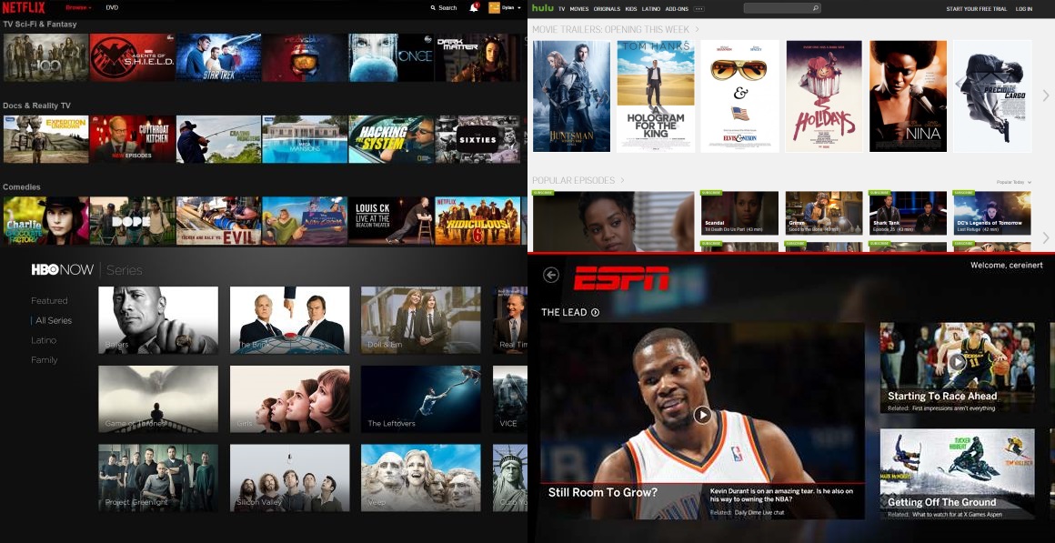
Clockwise from top left: the Netflix and Hulu web apps, ESPN Windows 8 app, and HBO Now Apple TV app.
Step 2: Design
With the project requirements in hand and a firm understanding of the platform, our client, and what we were up against, we embarked on the design. We started with a mile-high view of the app, then dug into the functionality of each page and finally the visual styling and brand touches. This stage featured many feedback cycles and iterations with the client in order to make sure our vision and theirs converged smoothly.
Information Architecture
We knew what functionality our app would have, so the first step of the design was to identify which functions belonged together and how much information to put on each page.
Our fundamental goal was to get users to content in as few steps as possible. We created a wide but fairly shallow hierarchy, avoiding lists within lists, and allowing users to drill down to almost any content with only 2-4 selections.
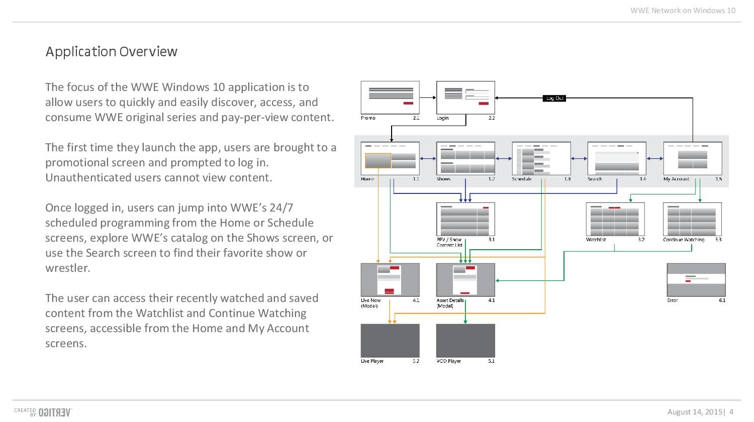
The application map and overview sum up the key screens and how users are expected to navigate them.
Wireframes
The wireframing process let us dive deep into the behavior of the app. We began by laying out the skeletons of each page one by one, ensuring that every function found its proper home. Keeping things low fidelity allowed us to iterate quickly, trying different configurations of controls and content until we found ones that behaved intuitively and guided the user's attention to where it needed to be.

We focused on the 8" portrait tablet, 8" landscape tablet, and 13" laptop as our core layouts. Creating 3 versions of each screen helped us avoid size-specilfic solutions.
The Home screen was particularly challenging.
Home initial
Home originally featured live content and a preview of the schedule above scrolling carousels of user-specific and featured content, such as Continue Watching and Recommended. Users would ideally be able to see a peek at part of a carousel, hinting at further content below; however, while the peek worked at an 8" screen size, at other sizes users would only see one or two complete carousels, and so have no idea of all the content beneath the fold!
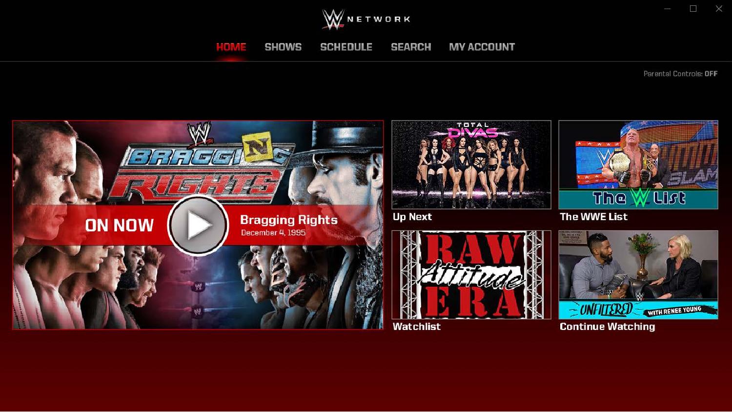
Home final
Our final design focused on one large On Now tile and four featured or personalized items to go with it. This layout was much more flexible, working easily on all screen sizes, and had the added benefit of surfacing the most important item of each of the prior design's carousels in the initial view.
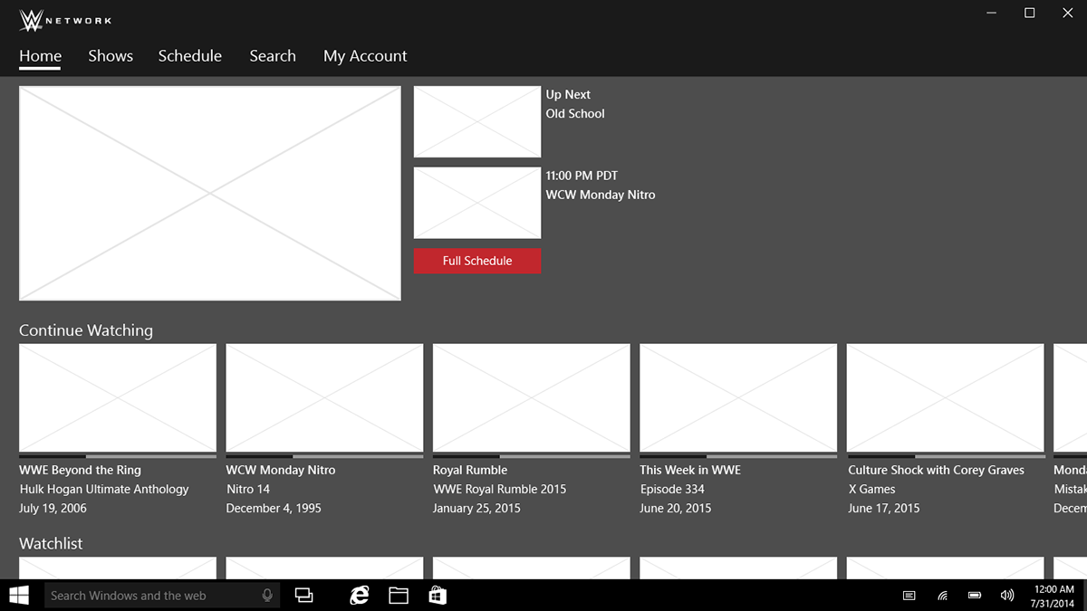
The first version of the Home screen featured several rows of content carousels, but at some screen sizes these would be completely hidden.

The final version focused attention entirely on featured or personalized content, and could resize or reflow easily to fit a wide variety of form factors.
Visual Designs
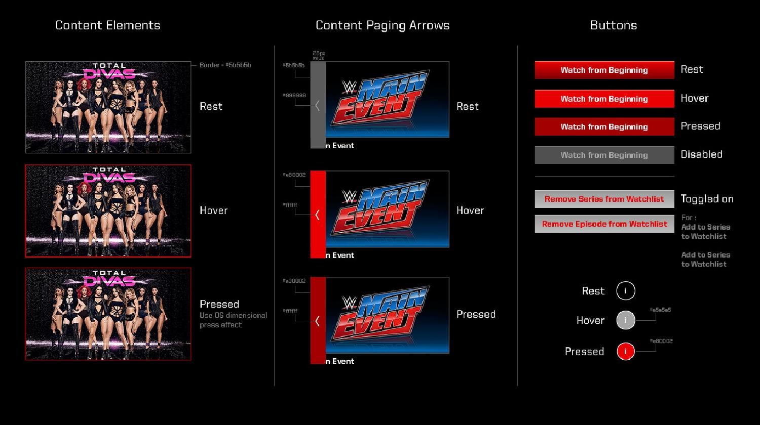
WWE has a very bold, brash, even audacious brand; it celebrates spectacle and personality. Combining graphic elements from previous apps and new ones created specifically for Windows 10, we created a style that we applied consistently throughout the app.
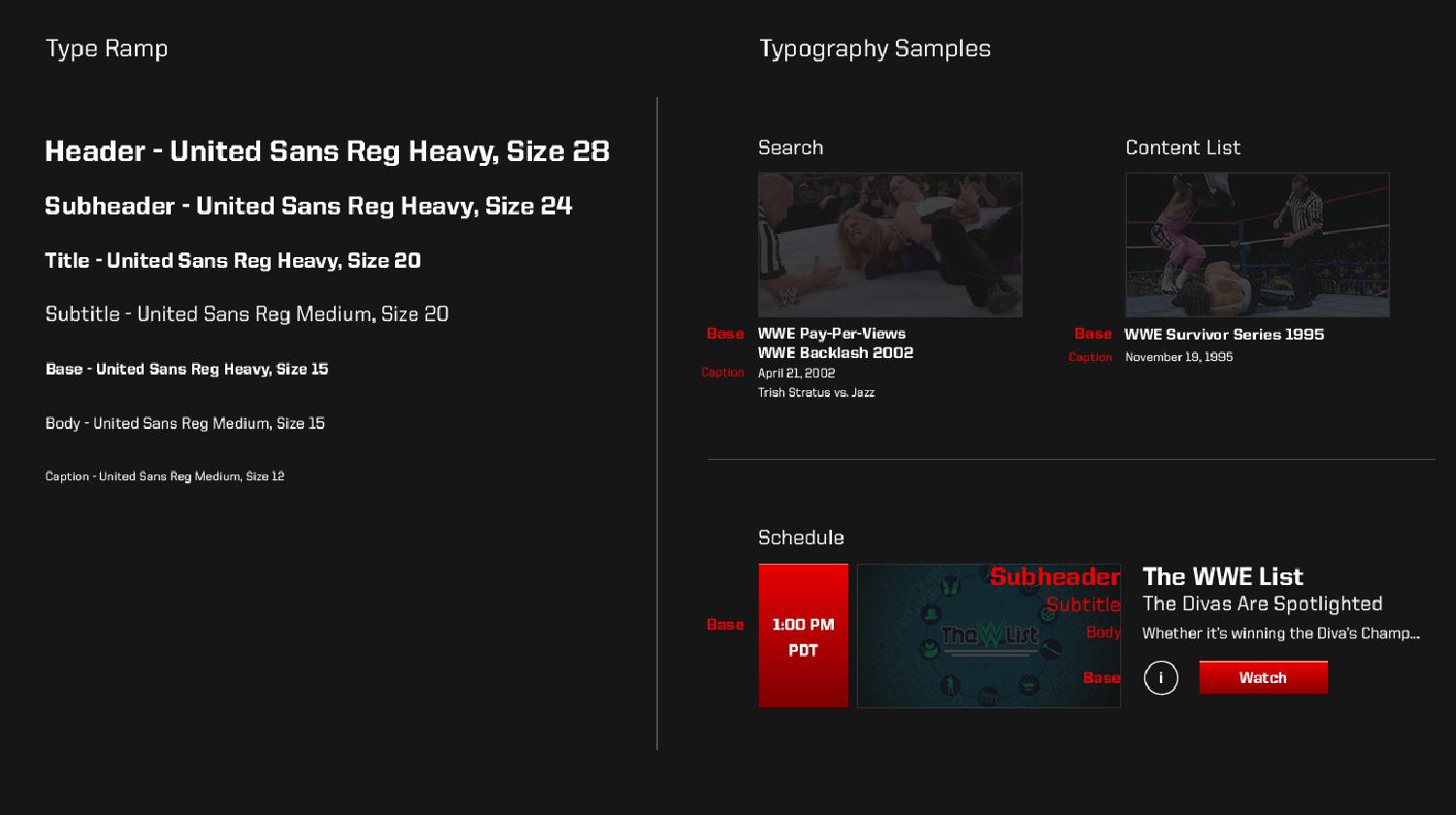
Study of WWE's catalogue of show assets showed a brand dominated by reds, blacks, and bold, jagged typography. Many of our choices reflected these tendencies, such as the angular United Reg Sans Serif font; but some, such as the smooth background gradient, were chosen to help WWE's content stand out even more.
Client Reviews & Iteration
Our weekly meetings with WWE began during the wireframing phase and continued throughout the design process. The feedback and criticism from these were essential to the success of the project, affording us the opportunity to pivot easrly and steadily home in on a product that could truly represent WWE.

Though they lacked emotional impact, wireframes were an important tool for expressing layout and intended functionality.

Visual designs gave the client a chance to see their brand in action, and often provoked great discussions and insights.
Responsive Design
A consistent challenge throughout the design process was adjusting elements to fit a huge variety of potential form factors. Even with a 500px minimum width, elements such as the header items underglow had to be carefully adjusted to fit.
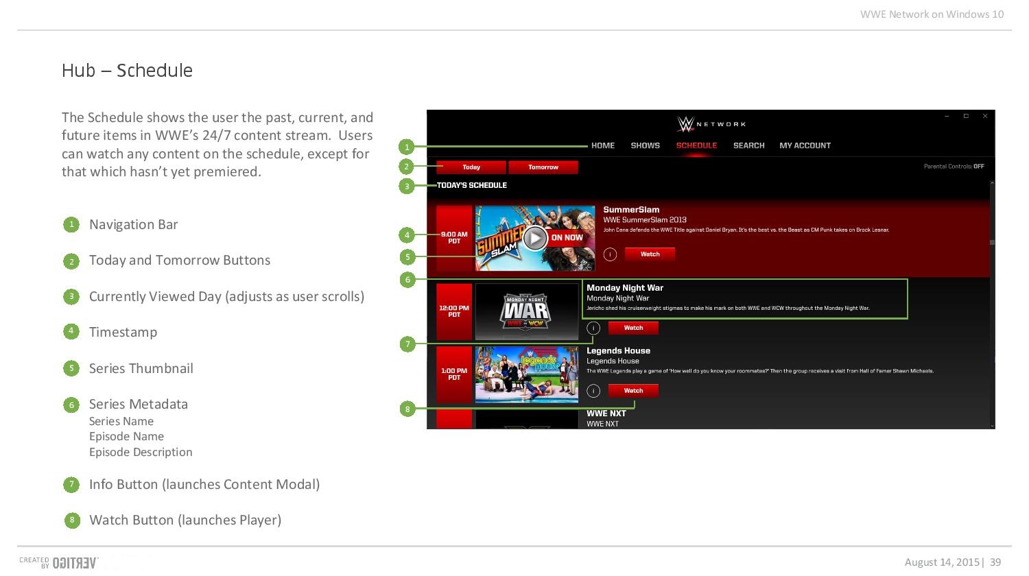
Some pages, such as Shows, were relatively unaffected, as they already featured horizontal scrolling or a small number of elements. For others, such as the data-heavy Schedule, we had to choose break points at which to hide descriptions and other metadata.

Some decisions, such as choosing when to wrap text and when to let it cut off, required a balance of UX and visual thinking.
Step 3: Production
Even with the full designs in hand, our work was far from over. In order to make sure our designs were realized as intended, we took care to create assets, document our designs and their functionality, and work with front- and back-end developers to get everything pixel perfect.
Asset Creation & Specification
We took care to take stock of available assets at the start of the project, since any new assets would require WWE generating a new image for every show in their extensive catalogue. Nonetheless, we made sure to detail exactly what type and size of source image every item should use. This translated to a smooth data mapping process later in development, and ensured shows and episodes each used their proper imagery.
As Windows 10 also requires a specific set of imagery for start tiles, splash screens, and Windows Store usage, we also cut a number of assets ourselves from WWE's source files. Creating an Illustrator document for this came in handy on a number of future Win10 projects.
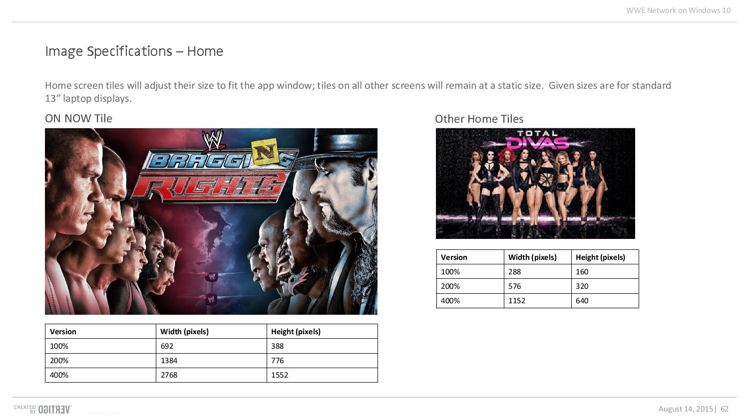
Windows 10 suggested including 200% and 400% images to accommodate even up to 4K resolution devices. In some cases we simply used the biggest image available.
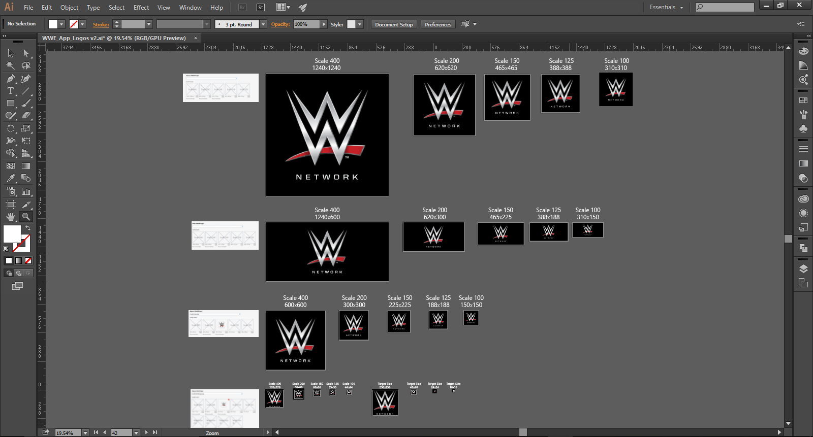
Assets used in the Start menu or other Windows locations required even more sizes: 100, 125, 150, 200, and 400% versions of every type.
Documentation
The WWE project marked the pioneering of a new type of design artifact: the Design Playbook. This document detailed not only the styling and image requirements of the app, but also included a walkthrough of the elements in each screen and their function. Accompanying the wireframes and visual designs, the Playbook served to keep design intent alive even long after the app had passed fully into the hands of development.
Developer Cooperation
Though the design playbook helped, the true secret to effective implementation was simply working directly with our developers to resolve issues. Staying in touch meant that they had the answers they needed and that we were informed of any reason our designs couldn't work as written. We could then massage the designs as necessary to get them to work as the platform allowed.

We primarily used Slack or simply walked over to one another's offices to resolve problems. Easy communication made implementation run ten times smoother.

This is a proof of concept Alan, our front end developer, whipped up to illustrate Windows animations. Seeing samples in action helped us pick the best options for the app.

By overlaying screenshots and visual designs, we were able to ensure pixel perfection in the final app.
Conclusion
WWE Win10 was a fantastic project to work on. Though the timeline was tight, a well-grounded, holistic, and thorough design process let us deliver a quality product. I'm confident that the fans who use it will be able to enjoy their wrestling without having to do any wrestling with their devices themselves.

Special thanks to Peter Harmon, Sean Dolinsky, and Alan Le, my coworkers and mentors on this project.