
VR Element Selection
In 2018, I led and published research on the use of virtual reality for element selection in computer-aided design (CAD) software.
You can view the presentation I gave on this research at HCII 2018 or read the paper via the link below, or scroll down to read the case study.
Project at a Glance
Table of Contents
Timeline: 3 months, September 2017 - Dec 2017
Project Type:Research Paper
Team: myself, two other graduate students, and two undergraduate students
My Role:
- Aided in academic and user research
- Led design and development of prototype, including project management of undergraduates
- Aided in usability testing and resulting paper
- Wrote paper accepted into HCII 2018 and represented project there
Tools: Unity, C#, Oculus Rift VR
Context
The Challenge: Taking CAD to the Next Dimension
Computer Aided Design (CAD) programs have been a mainstay of engineering for decades. The ability to create and manipulate three dimensional (3D) objects on a computer means engineers can iterate on their designs and see them from multiple angles without having to redraw a blueprint or craft a time-consuming physical model.
Yet, as powerful as they are, the 2D, mouse-and-keyboard controlled softwares currently in use have critical limitations. It takes an engineer's eye to visualize a 3D object from a 2D screen, and even then, the learning curve is steep. Accessing internal or obscured objects requires shifting or hiding intervening objects, and selecting multiple vertices or faces in 3D space using a 2D interface is no easy task.
Enter virtual reality. We knew that giving users depth perception and the ability to simply reach out and touch the elements they wanted could revolutionize the engineering process. But what particular needs could we solve, and how could we work VR into engineers' existing workflow instead of disrupting it? We decided to research and publish this as the primary project of our “Theory and Applications of Virtual Reality & Immersive Computing” graduate level class at UC Berkeley.
Team and Role
Our team consisted of three graduate students, including myself, who conducted research, usability testing, and publication; and two undergraduates who assisted in prototype development.
Me, VR designer & lead developer
So Yeon “Sophie” Park, UX design & usability testing
Amol Borcar, research & project management
Joshua Yang, developer
Anna Brewer, developer
I was involved in all aspects of the project, but my core responsibilities were as lead designer and developer for the prototype.
Design Process
User Research
Interviews
We suspected that VR could be useful for multiple parts of the design and review processes, so we conducted interviews with students and professionals in a variety of industries, including architecture, food manufacturing, clothing manufacturing, and electrical engineering, all of whom had used either some form of CAD or another type of 3D modeling software. Here's the key difficulties each group had with their software:

Engineers
It is difficult to look within an object or see cross-sections.
One person 'drives' during group reviews, and rarely do they make live adjustments.
Alters require precision, and frequently users alter without realizing it.

Artists & Architects
Accuracy matters, especially keeping consistent ratios.
It takes several months to gain proficiency in a 2D medium. Accessories such as 3D mice are important tools.
Architects work mostly in 2D and only use 3D when showing models to stakeholders.

Managers
Most communication can be done through phone and email.
Material, scale, and layout are difficult to communicate and expensive to miscommunicate.
Precision is extremely important; some companies operate on the scale of 5/10000ths of an inch.
We distilled these interviews into three issues that VR could help with:
Communicating scale
Viewing 3D objects, esp. internal or heavily obscured ones
Precision manipulation
Benchmarking
With these in mind, we looked at how existing VR applications might be adapted to support engineers. Our research centered on three applications that had overlap with 2D CAD programs.
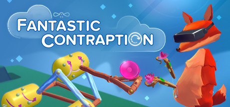
Fantastic Contraption
Contraption tinkering game

Google Blocks
Lightweight 3D block editor

MakeVR Pro
Advanced CAD tool
All of these allow users to build 3D models with varying degrees of sophistication. By virtue of being in VR, each does a good job of communicating the relative scale of objects and allowing users to navigate around a 3D environment. However, none of them allow exploration of the interiors of complex objects, and even MakeVR Pro, the most advanced of these, is still lacking in precision compared to 2D CAD and modeling software such as Solidworks, Solid Edge, and Maya.
In this case, precision means two things:
Setting precise numerical values
Choosing precise elements (e.g. particular vertices, edges, or faces)
We chose to study the latter due to its narrower focus and thus higher specific applicability to engineering.
Survey
Before beginning to prototype, we conducted one more round of user research: a survey of Siemens engineers. We asked about their experience with CAD and VR software and their difficulties in element selection. The results:
Element selection is tedious. It requires zooming and rotation to get to the right magnification and viewpoint, and often causes disorientation.
Selecting one type of element at a time would be useful. Users suggested a sub-menu that would allow them to predetermine which type of element could be selected.
Selecting multiple items is a big hassle. Users frequently accidentally select the wrong element or deselect everything, wasting time and causing frustration.
Prototype

Our goal for the prototype was to make an environment in which users could easily select elements (i.e. vertex, edge, or face) of an object, including internal elements. We wanted users to feel like they could pierce straight through to the element they wanted access to, not dissimilar to this scene from the Matrix Reloaded where Neo scoops a bullet out of Trinity.
To address some of the pain points discovered in the survey, we prioritized that users should always be able to see what is currently selected and what they are about to select.
Our constraints:
Use Unity and Oculus Rift.
Three weeks development time before we had to start user testing.
Leave room in the design for other CAD functions, e.g. don't use every button on the controller.
A video demonstration of the prototype can be found at the top of this page. Here's how we iterated on each of the major portions of the prototype. (Implemented utilizing the VR Toolkit.)
Environment
We wanted our environment to mirror 2D CAD programs, as we knew we'd be testing our software against them later. Therefore, we used Unity's standard grey plane as a backdrop and hung our object in the center near the user. Our goals for the object were to have something with internal elements that could be easily created in both Unity and a 2D CAD program, and that could be easily described to the user.
A major complicating factor was that Unity does not natively support objects with selectable vertices or edges. Thus, we had to mock up these elements using spheres, rectangular solids, and other Unity primitives. That being the case, we decided on two cubes, one within the other, as our objects of interest.

Outer Cube

Inner Cube
Navigation
We sought to emulate Google Block's intuitive navigation system, relying on the grip buttons of the Oculus Touch controller for most navigation. Navigation can be broken down into three parts: movement, rotation, and scaling.
Movement
Rotation
Scaling
We felt it was important that the software could be used from a front-facing seated position and for long periods of time, since that is how most of our users currently work. Thus, rotation to allow for users to study any side of an object without physically rotating, and scaling to examine the object as a whole or a small part of it without standing and sitting.
While the movement controls were well received by our users, the rotation and scaling were less successful. The implementation for all three was based on adjusting the camera instead of the other object(s) in the scene, which caused disorientation when rotating and strange visual effects when scaling. We'd also like to adjust the controls to require less movement of the user's hands to avoid fatigue. These would be high priorities for an update.
Selection
To keep with our design priorities of visibility and clear expectations, we made sure that the user always had visual feedback on the following:
Where their controller is
What is currently selected
What will be selected if they hit the trigger
Hover State
The item the user can affect by clicking the trigger gains a hover state: it becomes brighter than its surrounding elements. As only one item can be in hover state at one time, the user always knows what they're about to click on.
Adjusting brightness to indicate hover state has the advantage of working on all colors of objects, but we did have issues with ambient brightness and transparency making it difficult to see brightness levels.
Selected State
Selecting an element is simple: just hover the controller over the element and click the trigger.
We considered using a laser targeting system like MakeVR Pro, but decided that direct hover would make it much easier to choose specific internal elements. We chose to make the selected state a bold red so that there would be no ambiguity about which elements were selected.
Multiselect
To select multiple elements at once, the user holds down either A (on the right controller) or X (on the left), then selects the desired elements.
When designing the prototype, we had to answer the question: "Should elements deselect automatically when you select something else, or should they stay selected until you manually deselect them?" We called these the "Desktop" deselection model and the "Sticky" deselection model.
The Desktop model would be familiar to most users, as it behaves like choosing files on a desktop: unless you hold a button (typically Control), the only thing selected is the thing you most recently selected. This makes it easier to be sure you're only editing the element you're trying to edit, lowering the chance of the 'accidental edits' error.
The Sticky model would keep elements selected until a user manually hovered a selected item and deselected it, or did some action to deselect everything. It would make it easier for users to select multiple items at once and lower the chance of accidentally deselecting, which was a frequent and time-expensive user error.
Ultimately, we chose the desktop model on the assumption that it would be quicker to learn and avoid the more costly errors. We considered more advanced 'lasso' or 'block' select, allowing users to select groups of elements simultaneously, but they were out of scope for our timeline.
Intervening Object Transparency
This allows users to see their objects normally from the outside, but gives them the power to see as much or as little of the inside as they choose by reaching their hand through the object. Additionally, they can always see exactly where their controller is; it's never more than partially obscured by other objects.
We built this feature using Unity's raycasting feature. We set objects to turn transparent as soon as the user's hand was slightly past their position, so that the element the user was interested in wouldn't turn transparent as they were trying to select it.
Element Type Filter
One of our most important features, the Element Type Filter allows the user to choose what types of elements they would like to select - vertices, edges, faces, or all types. This allows the user precision in selecting particular elements, especially small ones such as vertices, without accidentally selecting larger nearby elements. Some of our users chose to always set the filter to the element they were interacting with, while others did everything in 'all'mode.
We include an icon next to the controller at all times to indicate what mode the filter is set to, in order to avoid users forgetting the mode getting frustrated when it invisibly blocks them from selecting something.
Controller Legend

The controller legend was a set of tooltips that could be summoned by holding down the B or Y button on the controller. It served as a reference for what each button did, how the user could navigate, and what modes the Element Type Filter could be set to.
While useful as a reference, the legend turned out to be hard to read and intimidating as user's initial guide to the controls. It's also notable that without a noise attracting user's attention to their hands, some users tried pressing the B/Y button with the controller out of sight, and never realized it existed until much later!
Usability Testing
Goals

We tested our prototype against a similar cube-in-cube construct in Siemen's 2D CAD software, Solid Edge. We were looking for qualitative feedback, as well as 5-point Likert ratings in four areas:
Intuitiveness
Ease of control
Physical discomfort
Mental discomfort
We chose these metrics to gauge how difficult VR software would be to learn and to execute commands with once users had learned it. Though these sessions were short, we also hoped to find out whether it would be feasible to use for longer sessions.
Our testers were nine students and Siemens employees with a range of experience in using CAD software.
Testing Procedure
After some preliminary questions and consent forms, we had the users start at random with either Solid Edge or our prototype. They were given 2 minutes to get acquainted with the software, then up to 5 minutes for each of three tasks: selecting a vertex, any three edges, and then three faces on the inner cube. They could receive a hint for each task if they got stuck.
We told the users to think out loud, and recorded both them and the screen of the PC they worked on. We followed up each section of testing with a series of questions on how they might envision VR in their workflows.
Results

On average, our users found the VR prototype much more intuitive, slightly easier to control, and significantly less mentally uncomfortable than the Solid Edge. Users had low levels of physical discomfort for both, though slightly more for VR.
The large improvement in intuitiveness reflects the utilization by VR of more of the body's natural capabilities and the removal of a layer of abstraction inherent to mouse-and-keyboard interfaces. With the addition of a tutorial (see Analysis & Recommendations) and as users gain more experience with VR, we expect this score to rise further.
Ease of control, or the ability for users to execute commands once they've learned the software, showed slight improvements in VR. Users expressed that once they got the hang of the controls in VR, they were able to execute actions very naturally, whereas using a mouse and keyboard they still had to be very precise with their motions.
Physical discomfort was low for both formats, but some users in VR did express slight disorientation or concern that some of the motions would become tiring in time. For future prototype iterations, we would try to magnify the user's motions so that they can operate comfortably while staying within the ergonomic comfort range for VR.
Mental discomfort was significantly higher for Solid Edge, as users frequently become frustrated or angry at the controls. However, we expect this was biased in favor of our VR prototype, as users likely had higher standards for themselves for learning and using 2D software than for VR software, and were frustrated when they couldn't meet their own standards.
Overall, we take these results as an encouraging sign that VR could be a useful and intuitive tool for manipulating 3D objects.
Analysis and Recommendations
After reviewing our findings, we arrived at three elements that are crucial to a useful and enjoyable VR user experience.
Tutorial
Given the lack of standardization and general user knowledge of VR user interfaces, a tutorial that acquaints the user with the capacities and intended use of an interface is vital. We expected that it would be obvious that the user needed to touch the cubes directly to select it, but it wasn’t: some users looked for a laser pointer or some other way to select, while some thought that they could do it remotely using the element type filter menu. Once we verbally introduced users to the idea of moving themselves over to the cube and touching it, most of them took to it like fish to water; but before that initial instruction, they floundered.
Familiarization with the hardware (i.e. the controllers) is important as well. Some of our testers had never used any kind of game controller before, and later confessed to us that they "did not know all the buttons were functional." If the user doesn’t realize a button exists, they won’t experiment with it.
The controller legend was useful to most users as a reference, but many found it overwhelming as a first introduction to the controls. We suggest that functions should be taught one at a time, giving the user the opportunity to practice in between each lesson, and that the user have the ability to refer back to previous lessons at will.
Environmental Context
In 2D CAD programs, it’s sufficient for the user to manipulate objects on an otherwise featureless grey background; but in virtual reality, the relationship of the user to the environment and the objects around them is incredibly important. Placing our users into a featureless grey plain at best left our users with no frame of reference for their interaction with the cube, and at worst disoriented some of them. Even something as simple as a plane to function as the ground would have helped with this.
The relationship between the user, the environment, and the object(s) in the scene creates further expectations for the user. In our prototype, the cube was the only thing in the environment other than the user; thus, many of our users expected that they would be moving, rotating, and scaling the cube, as in the 2D program. Several users were surprised when they found out they were instead moving themselves. Had we included other selectable objects, or even something like a pedestal for the cube to rest on, could have corrected for this.
The size of the user as compared to the object(s) in the scene is also important. Different sizes afford different interactions: a user is going to behave differently with something the size of a Rubik’s cube than something the size of a shipping container. This is also an ergonomic consideration - if the user has to use large movements to climb all over an object in order to select elements of it, they will quickly get tired. Thus, the tradeoff between large objects which allow precision, and small objects which can be manipulated ergonomically, is one designers should consider carefully.
Action Feedback
Our users enjoyed getting feedback about their actions. At its most basic, that meant seeing the virtual controllers move when they moved them in physical space. Most of them expressed relief that they could see the small cube simply by reaching or leaning through the big cube in VR, compared to the complex maneuvers necessary to do so in 2D.
We also received mostly positive feedback about the easy to see selected state, and the visual reminder of what mode the Element Type Filter was in prevented a lot of confusion. The haptic and audio feedback from changing modes on the filter was also valuable. There was some frustration when users didn’t receive enough visual feedback: the increase in brightness that indicated the hover state wasn’t always visible due to ambient lighting conditions.
We believe that visual, audio, and haptic feedback should be available for almost every action the user takes or mode they select. When a user is displaced into virtual reality, they lose feedback that they’ve lived with all their life such as seeing their hands; failing to introduce alternate forms of feedback in a design will inevitably result in confusion and disorientation.
Conclusion
Our experiment showed that VR can address at least two major pain points of CAD: viewing 3D objects and precision element selection. By relying on their depth perception and hand-eye coordination, new users can understand the scale of 3D objects and perform basic operations with a fraction of the training it would take to do so using a 2D interface.
While it will take time for VR applications to match the complexity of modern day CAD tools, VR undoubtedly holds incredible potential for allowing users to view and manipulate 3D models.