

Siemens AR for Industry
In the summer of 2018, I worked as an augmented reality design intern at a Siemens research group in Berkeley to create an AR application for city infrastructure maintenance. I worked alongside other interns and employees on the broader platform, but the design and development of the HoloLens interface was entirely my work. The details here have been changed to protect Siemens’ IP and NDA requirements.
Table of Contents
Project at a Glance
Timeline: 11 weeks, June-August 2018
Project Type: Internship
Team: myself, a researcher, a back-end developer, and our PM
My Role:
- Understand capabilities of proprietary algorithm.
- Conduct indirect user research.
- Design and develop basic interaction flow prototype.
- Record and edit demonstration video.
- Prepare prototype for handoff & live JSON feed intake.
Tools: Unity, C#, Invision, Adobe After Effects
Context
The Challenge
When critical pieces of city infrastructure go down, delays in repair time can be measured in dollars and lives. At Siemens, I designed and prototyped an augmented reality (AR) app for the Microsoft HoloLens that helps experts quickly install software and dispatch technicians that can get our cities back up and running.
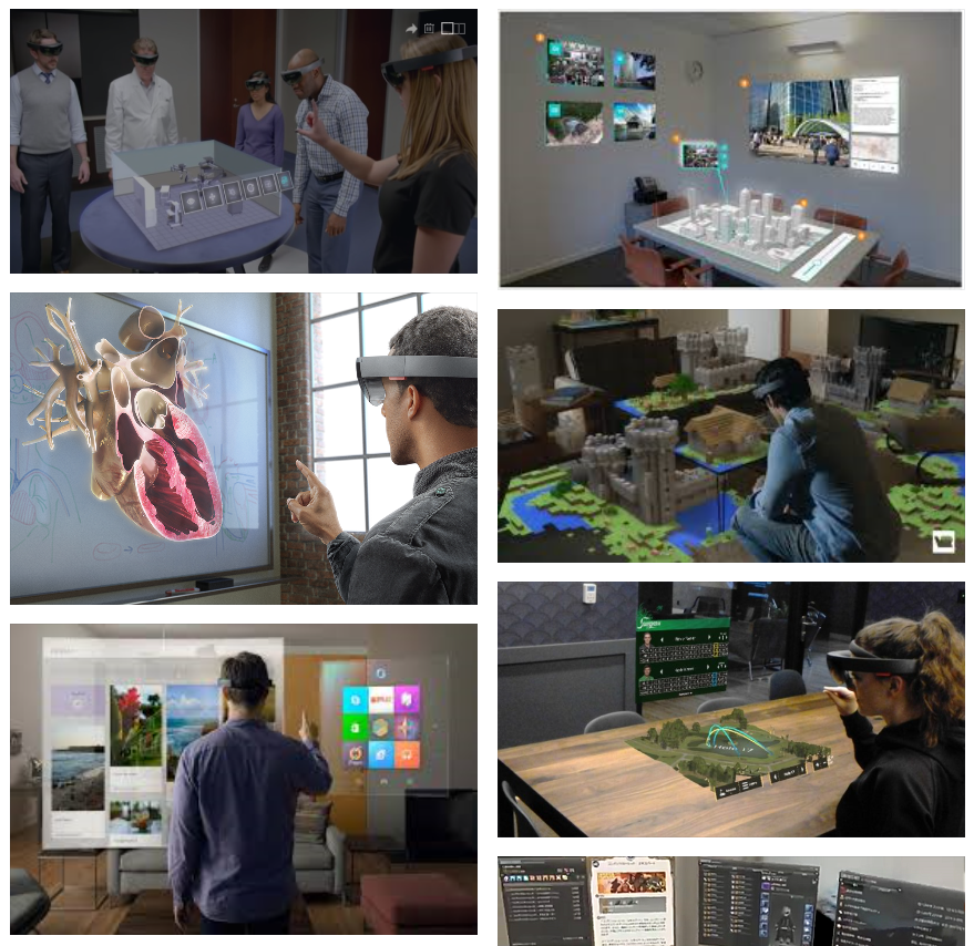
Note: The details here have been changed to protect Siemens’ IP and NDA requirements. I’m unable to share images from the project itself, so I’ve recreated key concepts using the virtual reality app Google Tilt Brush.
Problem Definition
Siemens is an international company renowned for its innovation in industry and infrastructure. When I joined their Berkeley research office as a design intern at the start of summer in 2018, they had just developed an algorithm that could revolutionize the way we perform maintenance and emergency repairs on certain kinds of city infrastructure, automating much of the formerly manual repair procedure.
Implementing this algorithm would translate to lives and millions of dollars saved in the case of emergency. Siemens chose to use the Microsoft HoloLens to showcase the algorithm because of its potential for 3D visualization, collaborative use, and portability, and brought me on to create a prototype for the platform.
Our project had two goals.
Create a prototype and video to win the approval of our key stakeholder: a state government board. If we could convince them of the potential of the application, the project could move on; if not, it would be stopped dead in its tracks.
Prepare the prototype for further development by Siemens, ideally making it robust enough to support a wide range of city types.
Users
Our users were experts operating certain kinds of city infrastructure. One of their primary duties was to monitor the city’s network for problems and correct them ASAP when found, either by installing software remotely or by dispatching a technician. We knew they would need an efficient, reliable solution that could help them make multiple decisions quickly in times of crisis.
Team and Role
Our team was four people: myself, a researcher, a back-end developer, and our project manager. With the researcher laying the foundational underpinnings for the algorithm and the developer hooking up JSON feeds and preparing for implementation, that left me in charge of design and development of the HoloLens interface. This included:
Setting a schedule for the interface with the rest of the team
Conducting research including competitive benchmarking and internal usability tests
Sketching storyboards, information architecture, and wireframes
Developing the application in Unity and C#, including visual design implementation and JSON-based dynamic components
Producing and narrating a promotional video for stakeholders
Constraints
Timeline
My internship lasted 11 weeks, an ambitious time frame considering the scope of the project.
User Access
The NDA agreements binding the project meant that we couldn’t contact our end users directly; our information had to pass through multiple offices to reach us. We ultimately only got a single round of questions answered in writing, and not by the users themselves. Additionally, our user testing had to be conducted internally on other folks in the office.
HoloLens
We were using the Microsoft HoloLens as our augmented reality device of choice. The HoloLens had excellent motion tracking and mapping, but its small field of view caused some serious design revisions later in the project.
Augmented Reality Experience
At the start of the project, I had some experience developing in Unity for VR, but none at all for AR, and had barely touched the HoloLens even as a user. I had to learn AR standards and setup for the platform while on the job! This would eat up a chunk of precious time at the start of the project as I scrutinized over three dozen articles of Microsoft’s HoloLens design guidelines and troubleshot the process of getting content from Unity onto the device itself.
Design Process
Step 1: Research - Understanding Our Algorithm and the HoloLens
Starting out, I knew I needed to get up to speed on the ins and outs of both our algorithm and the state of HoloLens design. To do so, I:
Talked with our researcher and developer on what the workflow for the application would have to look like, based on the inputs and outputs of our algorithm.
Carefully read over the design guidelines and other relevant resources.
Compiled a HoloLens mood board on Invision using both search results and screenshots from my own testing sessions with our HoloLens.
Sent out what user questions I could.
Step 2: Sketching and Storyboarding - Confirming the Workflow
From the research above, and after a few quick sketches exploring different ways of displaying information in augmented reality, I drew some storyboards to serve as our first major design artifact. These explored the main workflows our users would go through and served as both a tool to confirm the design vision with teammates and a template for the initial prototypes.
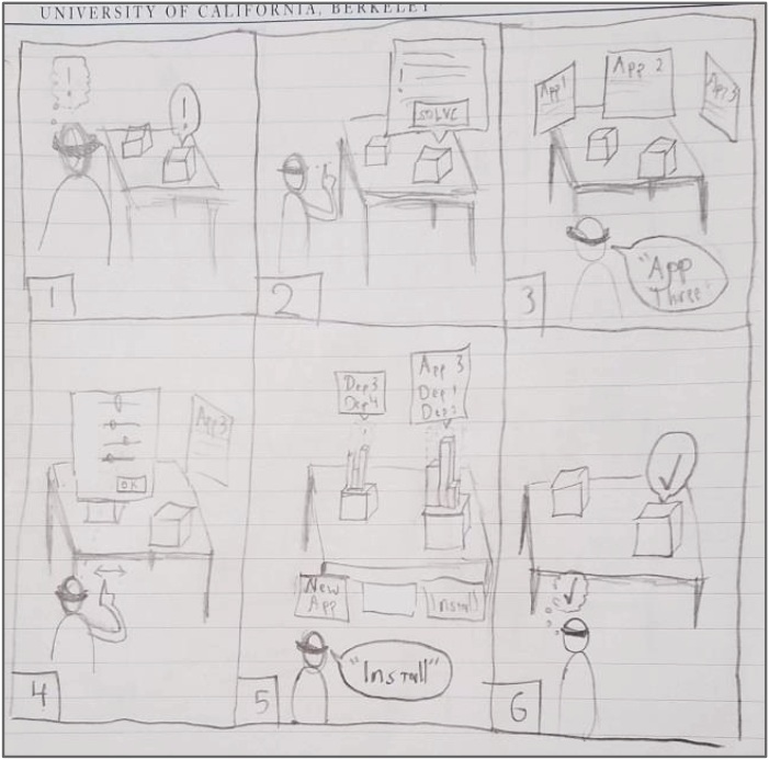
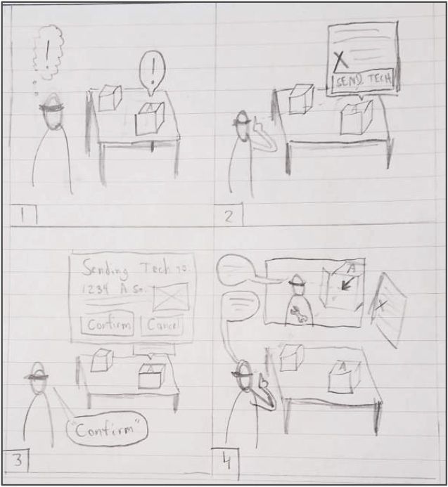
In this case, the storyboards help represent two potential workflows for the user - one in which they can solve the problem entirely using the application (left), and another in which they have to send a technician to the affected site and communicate with them in order to solve it (right). Sharing these storyboards with the team allowed me to build shared understanding on basic use context and common scenarios with my team.
Step 3: Early Prototyping - From Paper to Hologram
With the familiar processes of research and storyboarding behind me, it was time to move into the unknown: the holographic realm of AR prototyping. Knowing that a 2d sketch would simulate an AR experience about as poorly as a written description would describe a Picasso painting, I wanted to try out my ideas in the HoloLens as quickly as possible.
Unfortunately Microsoft’s tool for rapid prototyping, HoloSketch, stubbornly refused to run on our system; instead, I built my layouts in Unity and previewed them with the Mixed Reality Toolkit. However, understanding how to implement gaze, gesture, and voice controls for the HoloLens took quite some time, especially with the labyrinthine documentation of the toolkit; combined with other technical setbacks, it was nearly time for the scheduled user testing by the time I had the initial prototype up and running.
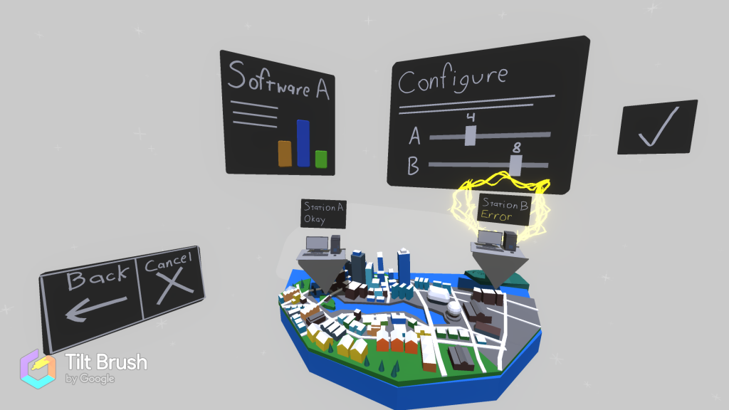
Initial Interface: Panels Galore
A simulacrum of the first prototype. The user chooses a relevant object from the map, and its panels float above it and around the user.
Note: the above image is a replica of the original NDA-protected Unity interface, created in Google Tiltbrush for portfolio demonstration purposes.
Step 4: User Testing - Learning the HoloLens’ Limits
Our initial prototype lacked polish, but was capable of simulating an ideal path through each our key workflows. Our internal test subjects wouldn’t have the expert knowledge of our actual end users, but we wanted to understand whether they:
Could navigate through the application successfully
Preferred gestures or voice controls and why
Could use the application while referencing other information
Would notice and be able to read all the control panels and displays
I scheduled, conducted, recorded, transcribed, and summarized ~45 minute user testing sessions with 5 Siemens employees. (Due to our NDA, we couldn’t test with anyone outside our office.) I informed them of the context of the project and the operator’s duties, had them run through both main workflows (installing software remotely and dispatching a technician), then followed up with an interview.
While our users marveled at the futuristic feel of using the application, few of them were able to complete the workflows without guidance. I learned two main lessons that caused me to rethink my approach for the second prototype.
1. Always guide your user’s attention; they can’t see as much as you think.
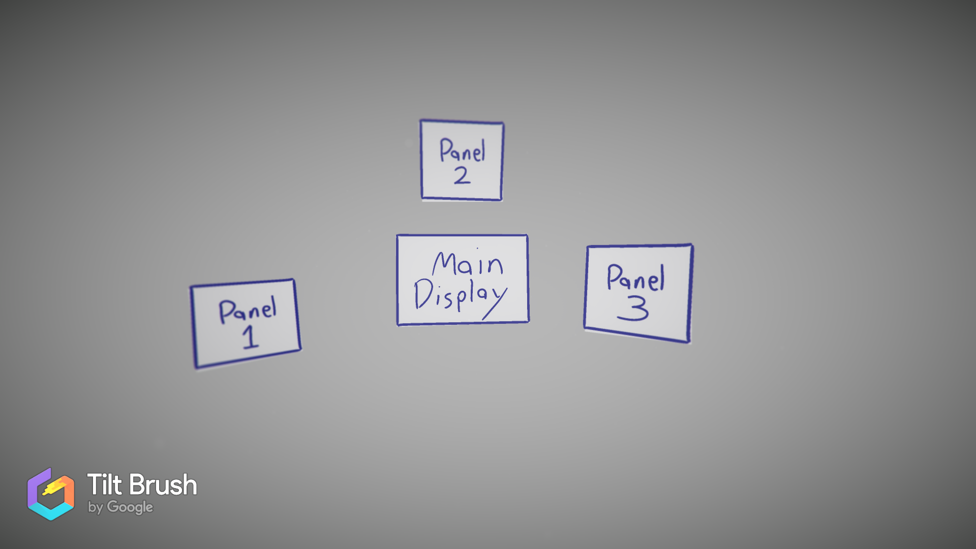
Although the screen real estate was expansive compared to a 2D monitor, the limited viewing pane of the HoloLens meant that the user often couldn’t see things outside the focus of their gaze. Often users wouldn’t realize that some large part of the interface had appeared or disappeared because they weren’t looking directly at it at the time, which caused no lack of confusion.
Note: the above images are replicas of the original NDA-protected Unity interface, created in Google Tiltbrush for portfolio demonstration purposes.
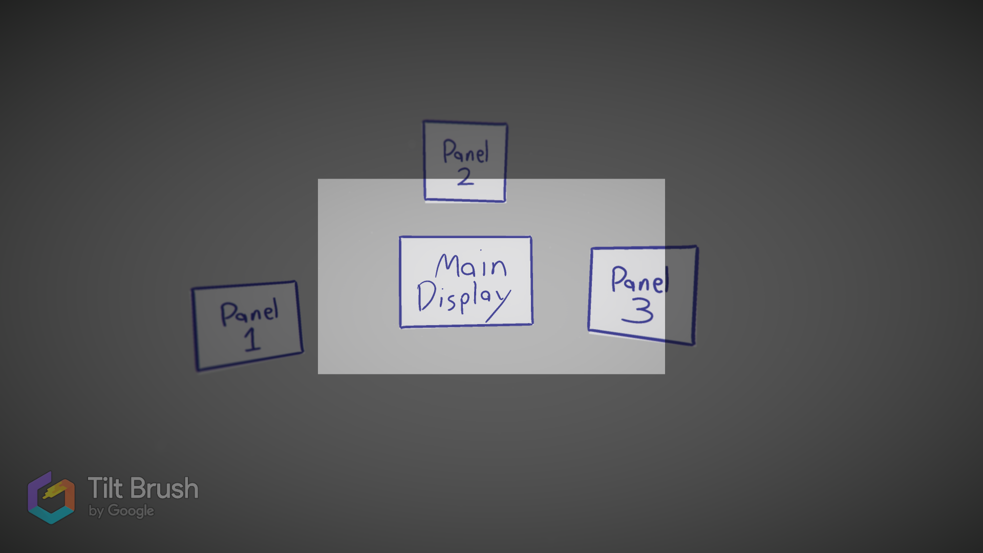
2. Beware occlusion - floating panels get in the way or get lost quite easily.
Depending on what angle the user was looking at, objects could frequently get in the way of one another and block the user’s gaze. The problem was especially bad for objects with the TagAlong feature that kept themselves in the user’s view, as these would often place themselves in front of or behind other interactable elements and stop the user from accessing one or both.
Note: the above image is a replica of the original NDA-protected Unity interface, created in Google Tiltbrush for portfolio demonstration purposes.
Step 5: Final Prototyping - Implementing Feedback
Based on our feedback, I made several changes to improve the app’s usability.
1. Improved Attentional Indicators
We added a suite of both dynamic and static attention indicators to help guide the user’s attention to where it needed to be.
Dynamic indicators appear as arrows near the center of the user’s gaze; these would point towards an affected machine like a compass points north, and their color indicated whether the machine could be fixed with software or would require a technician.
Static indicators were simply rows of arrows that would flip up or down to indicate whether the user should be looking up at the panels or down towards the map. We placed the arrows so that they were in the user’s peripheral vision when their direction flipped, sending the user’s gaze to where it should be for the next step.

The dynamic indicator (yellow arrow) and static indicators (grey arrows) kept users looking where they needed to.
Note: the above image is a replica of the original NDA-protected Unity interface, created in Google Tiltbrush for portfolio demonstration purposes.
2. Change Panel Layout from “Paper on the Wind” to “Petals on a Flower”
In my initial layout, key information and navigation controls were placed on panels that floated around the user like pieces of paper blown on the wind. This caused a lot of occlusion issues and meant that users often didn’t know exactly where a given panel was at any one time.
I checked over my InVision reference board, and found inspiration in an interface that reminded me of a flower, with the key object in the middle and other objects radiating out from it like petals. This ensures the user can easily locate key information and options simply by looking up, down, left, or right from the main object of their attention.

The new layout kept things centralized, ensuring the user didn’t lose track of which controls or information they had available.
Note: the above image is a replica of the original NDA-protected Unity interface, created in Google Tiltbrush for portfolio demonstration purposes.
Putting A Bow On It
In addition to these improvements, I made sure to apply a layer of polish and branding. I sampled from Siemens’ other products to get a branded color scheme and font, adjusted it to improve hologram visibility, and added a few borders and modified materials to help each hologram stand out. I also customized the particle effects and added a few finishing touches.
With everything in place, we felt confident in the demo we sent to our stakeholders. While I wasn’t able to present directly to the stakeholders, I did record a video showcasing the app’s features and enumerating its advantages. Additional back-end improvements that enabled dynamic city networks based on JSON data from Siemens’ network, and some tending to the project read-me, brought my time at Siemens to a close.
Retrospective
I’m proud of our progress. The video and demo garnered a lot of positive feedback from our stakeholders, many of whom had never used the HoloLens before. We only got some minor feedback on the visual effects we used to show a problem (namely, that the effect for the machines catching on fire looked like a stream of smiley faces) and when I left it, the project was ready to move on to the next phase. Success!
I believe we made a great proof of concept for the HoloLens as a support tool for infrastructure maintenance given the constraints we had. In a perfect world, though, I would have liked to change two things about this project:
The lack of a reliable rapid prototyping tool made it expensive to explore different variations of the initial layout. Knowing what I do now about the small viewing window and low peripheral vision of the HoloLens, I would probably try out some different ideas.
With a project so far divorced from actual users, it’s hard to say just how applicable our solution was; getting a chance to observe how the operators actually work and examining the software they use now would have lent the project more validity.
Overall, I’m pleased with this foray into the world of augmented reality design. It was great to have a supportive team that encouraged my experimentation, coworkers willing to take the time to sit down for user testing, and the autonomy to set my own schedule for design research and iteration. I’m eager to take what I’ve learned on this project and put it to good use designing further AR applications.